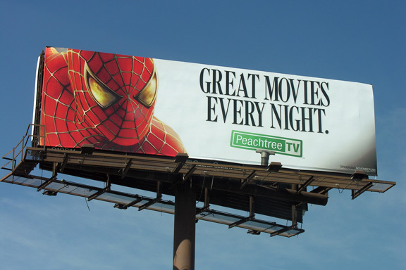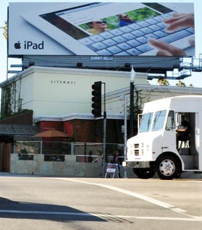
Billboards are a staple of OOH advertising, but designing them can be tricky. The audience of any given billboard will likely have only a few seconds to interpret what they’re seeing. In this post, we’ll outline some tips and tricks to make your billboard as effective as possible.
Outline your Objective
Outlining ONE clear and concise goal is the first step to creating a successful billboard. By delivering a simple message consumers will better understand what steps your company actually wants them to take. Whether you are trying to bring diners to a local restaurant, attract visitors to your website, or simply promote your brand, craft your message around a central goal to drive results.
Make Your Ad Stand Out
- Use 7 words or less to
 communicate your company’s key objectives. Consumers are more likely to be able to fully understand your message if it’s short and simple.
- If you plan on including your logo in your billboard design it should be no smaller than ⅛ of your billboard size. Any smaller than that and it may be hard to notice.
- Make sure to use bold, exciting colors in order to attract attention. Primary colors such as red, blue, and yellow, naturally attract the eye and are great for billboards.
- If you are going to have a detailed image in the foreground, keep the background simple. Otherwise, your billboard may look cluttered and distract from your message.
- Contrast is your friend. Take advantage of it. Make your center of attention colorful, and then place it in a world of gray to achieve a dramatic effect.
- Use a bold sans-serif font in either white or black for your main text. This will allow for the easiest readability and provide high levels of contrast.
- Think about including a play on words. It engages consumers and gets them thinking
- Do something a little crazy. Most billboards limit themselves to a 14’×48’ canvas, but it’s not mandatory. Extending your billboard outside of that canvas with an additional component can really make the ad stand out!
Take a Step Back…
…both figuratively and literally. Remember that many people who see billboards see them from far away. Take some time to view your design from their perspective. Take a few steps back and try to determine if your billboard can be understood in about 5-10 seconds from a fair distance away. If it seems even remotely unclear, take a step back in your process and try to simplify your billboard.
Once you have created your perfect billboard design check out DOmedia, the host to the largest database of OOH vendors in the US, and start looking for the perfect OOH venue.


