The Future of OOH: What Blade Runner 2049 Gets Right and Wrong

BR-CC-7645-620x246


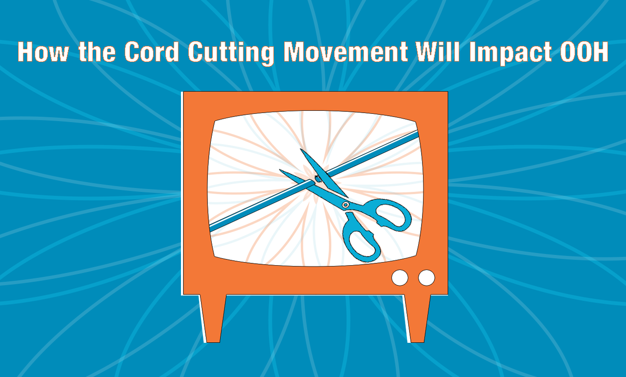
Based on the novel Do Androids Dream of Electric Sheep? by Philip K. Dick, the original Blade Runner film was released in 1982. This existential neo-noir film was set in dystopian Los Angeles in the year 2019. It would be remembered as genre-defining science fiction, particularly for its striking visuals. The most iconic imagery from the film comes from the out of home (OOH) advertising-filled cityscape of future LA. While we never got the flying cars or video phones the film predicted we would, we did get a lot of the neon signs and video billboards.

Thirty-five years later we have its sequel, Blade Runner 2049. In the film universe, thirty years have passed since the original. The filmmakers were tasked with imagining an updated future LA, OOH advertisements and all. Let’s take a look at what we think the film got right — and wrong  about the future of OOH ads.

This article was originally published by the Outdoor Advertising Association of America. You can continue reading the full article here.


How to Design a Billboard

ccoatlbulletin
Billboards are a staple of OOH advertising, but designing them can be tricky. The audience of any given billboard will likely have only a few seconds to interpret what they’re seeing. In this post, we’ll outline some tips and tricks to make your billboard as effective as possible.

Outline your Objective

Outlining ONE clear and concise goal is the first step to creating a successful billboard. By delivering a simple message consumers will better understand what steps your company actually wants them to take. Whether you are trying to bring diners to a local restaurant, attract visitors to your website, or simply promote your brand, craft your message around a central goal to drive results.

Make Your Ad Stand Out

  • Use 7 words or less to billboardcommunicate your company’s key objectives. Consumers are more likely to be able to fully understand your message if it’s short and simple.
  • If you plan on including your logo in your billboard design it should be no smaller than ⅛ of your billboard size. Any smaller than that and it may be hard to notice.
  • Make sure to use bold, exciting colors in order to attract attention. Primary colors such as red, blue, and yellow, naturally attract the eye and are great for billboards.
  • If you are going to have a detailed image in the foreground, keep the background simple. Otherwise, your billboard may look cluttered and distract from your message.
  • Contrast is your friend. Take advantage of it. Make your center of attention colorful, and then place it in a world of gray to achieve a dramatic effect.
  • Use a bold sans-serif font in either white or black for your main text. This will allow for the easiest readability and provide high levels of contrast.
  • Think about including a play on words. It engages consumers and gets them thinking
  • Do something a little crazy. Most billboards limit themselves to a 14’×48’ canvas, but it’s not mandatory. Extending your billboard outside of that canvas with an additional component can really make the ad stand out!

Take a Step Back…

…both figuratively and literally. Remember that many people who see billboards see them from far away. Take some time to view your design from their perspective. Take a few steps back and try to determine if your billboard can be understood in about 5-10 seconds from a fair distance away. If it seems even remotely unclear, take a step back in your process and try to simplify your billboard.


Once you have created your perfect billboard design check out DOmedia, the host to the largest database of OOH vendors in the US, and start looking for the perfect OOH venue.


Truck Advertising

If you are an advertiser looking to capitalize on a captive market but want to do more than just purchase a static billboard then truck advertisements might be the perfect OOH format for you. According to a study done by the Harvard Health Watch, the average American spends 101 minutes per day driving. That’s nearly two hours every day where drivers could be exposed to OOH advertising. Truck side ads and mobile billboards are great ways to get noticed and gain exposure among targeted audiences.

Truck Side Ads

truckside2

Truck side ads are exactly what they sound like. They’re ads placed on the side of freight trucks! These ads usually measure either 48 or 53 x 13 ft. on the sides of trucks and 8 x 13 ft. on the back. Truck side advertisements are incredibly efficient at reaching massive amounts of consumers. Due to their high levels of exposure, truck side ads have an incredibly low CPM compared to other formats and make them an optimal choice for brands looking to reach a wide and diverse audience.  

Mobile Billboards

mobile2

Another form of truck advertising is mobile billboards. These are typically fitted with vinyl advertisements on both sides and then hired to drive along specified routes or be parked in designated locations in an attempt to reach target consumers. Unlike truck side ads, which can be seen as secondary to the freight they travel alongside, mobile billboards are designed specifically with marketing in mind. In fact, they are so effective that Outdoor Advertising Magazine reported that mobile billboards can have as high as a 97% recall rate.

Additionally, this format is very flexible. Mobile billboards can be fitted to display digital messages, interactive programs, and even play sound for passersby to hear. Mobile billboards tend to be more expensive than truck side ads in general, but size and price truly vary in different markets. Perfect for tightly packed metropolitan areas, but certainly capable anywhere, mobile billboards provide a flexible OOH solution to any company looking to gain large amounts of exposure in a specific location.


If you’re interested in securing some mobile advertising for yourself, or your company, start your search with DOmedia, the host to the largest database of OOH vendors in the US!


Vendor Spotlight: Entry Media

OSCAR GCT Oct 2017 06 (1)DOmedia, the host to the largest database of OOH vendors in the US, is constantly encountering innovative vendors. In our Vendor Spotlight series, we attempt to highlight these companies and explain to you how they are pushing the industry forward. Today we’re focusing on Entry Media, a company that provides options for turnstile advertising.

Entry Media offers a truly unique and effective advertising opportunity. Since 1994, they have been helping brands with their proprietary, high-quality, hand-machined in the U.S.A., custom-fit Turnstile AdSleeve® units that attach onto turnstile arms.

Turnstiles are located at the entry and exit points at high traffic locations including subway stations, professional sports venues, college arenas, stadiums and recreation centers, amusement parks, office buildings and more.NEW BALANCE Columbus Circle Oct 2017 02 (1)

Turnstile AdSleeves offer advertisers the rare opportunity of having consumers both see and touch their brand message. Studies show that turnstile advertising with Turnstile AdSleeves boasts a 66.7% unaided advertiser recall rate. In addition, once consumers are exposed to the brand message on the turnstiles, viewers are even more observant of other ads for the business, digital or otherwise, that they see around them.

The extensive 5!Senses Research Study conducted by Millward Brown showed that brand impact increases by 30% when more than one sense is engaged. This is one reason that makes the Turnstile AdSleeve message so valuable. Viewers not only see but also touch the message as they enter and exit via turnstiles.

With the growing importance of mobile and digital media, Entry Media’s Turnstile AdSleeves offers advertisers a simple and effective tool to further enhance a company’s branding campaign.

Let’s hear from some of their clients:

“Since we arrived at Fenway 15 seasons ago, Entry Media’s Turnstile AdSleeves have allowed us to effectively help our clients to stand out with their brand message. Both the product and the overall service make this relationship a true winner for the Boston Red Sox.”
-Troup Parkinson EVP, Partnerships, Boston Red Sox

“We’ve had great success for close to ten years utilizing the Turnstile AdSleeve units. These unique offerings help amplify our many clients’ brand messages in the New York City Subway system influencing the roughly two billion consumers who ride every year.”
-Jodi Senese, Chief Marketing Officer at OUTFRONT Media.

If you want to learn more check out the Entry Media vendor page here.

Want to be featured on our blog? Fill out our short vendor questionnaire here.


GRP Advertising Definition

TRP Screenshot


Out-of-home advertisements are a very effective marketing medium, but how do you quantify the impact of traditional media ads? The industry developed a system to determine an ad’s effectiveness. Today’s blog post will give a quick and succinct explanation of both GRP and TRP.  

The first term we need to define is impression. In OOH, impressions are the number of times people are likely to notice an OOH ad. How are these impressions determined? In the OOH industry, the standard for measuring is Geopath. Geopath is a “not-for-profit organization governed by a tripartite board comprised of advertisers, agencies, and media companies.” They use a variety of means to provide the most accurate impression data related to OOH. Once we have the impression data, we can accurately figure out the GRP.

GRP (Gross Rating Point)

GRP, or gross rating points, are a standard measure in advertising used to measure exposure. GRP is the total number of impressions delivered by an ad schedule expressed as a percentage of a market population. In other words, it’s all adults aged 18+. It refers to the percent of the total viewing audience reached multiplied by the exposure frequency. This score is commonly considered to be the primary analytic currency for OOH, but it is also used when planning and buying other types of media. For example, GRP would be used when promoting the upcoming census since they’re trying to reach everyone.

The formula used to calculate the GRP is:

(Reach (% of Audience Reached) × Frequency (# of ad impressions)) × 100

So if 30 percent of the viewing audience sees your billboard 4 times, that ad would have a GRP of 120 ((.3 × 4) × 100).

TRP (Target Rating Point)

Using GRP works well when you’re trying to reach all adults 18+, but in cases where your target is more narrow, it may be more valuable to use TRP. TRP, or Target Rating Point, enables you to determine the number of GRP’s achieved by an advertisement among targeted individuals within the larger viewing population. The calculation is actually rather simple.

The formula used to calculate the TRP is:

GRP × Target Audience as a Percent of Entire Viewing Audience

Going off the earlier example, assume you are targeting males ages 18-25. If you know that this demographic makes up 35 percent of your entire viewing audience your new TRP would be 42 (120 × 35).


That’s all there is to it! Figuring out GRP and TRP isn’t all that scary, after all. We also have tools that can easily calculate TRP and GRP for you. Want to learn more? Feel free to request a demo.